Learn how to centre last-line elements in a CSS grid using grid-auto-fit. By combining pseudo-elements with specific CSS properties, you can improve the aesthetics and responsiveness of your layouts.
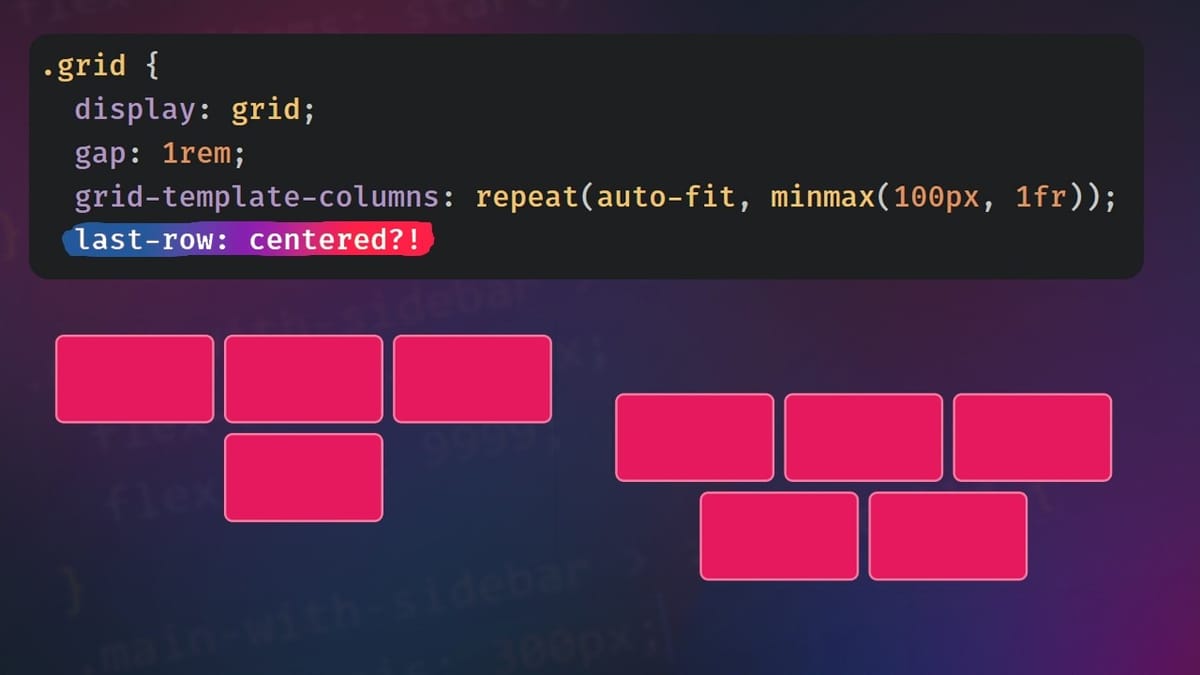
In modern web development, creating flexible and aesthetically pleasing layouts is essential. Using the grid-auto-fitproperty in CSS Grid Layout allows you to create adaptive grids, but it presents a challenge: last-line elements often align to the left, even if they don't fill the entire available width. This article explores a method for centring last-line elements when using grid-auto-fit.
Understanding grid-auto-fit
The grid-auto-fit property allows you to create responsive grids by automatically adjusting the number of columns according to the space available. However, when the number of elements does not completely fill the last row, they align to the left by default, which can detract from the aesthetics of the layout.
Centre Last Line Elements
One approach to centring last-line elements is to use pseudo-elements and specific CSS properties. Here are the key steps:
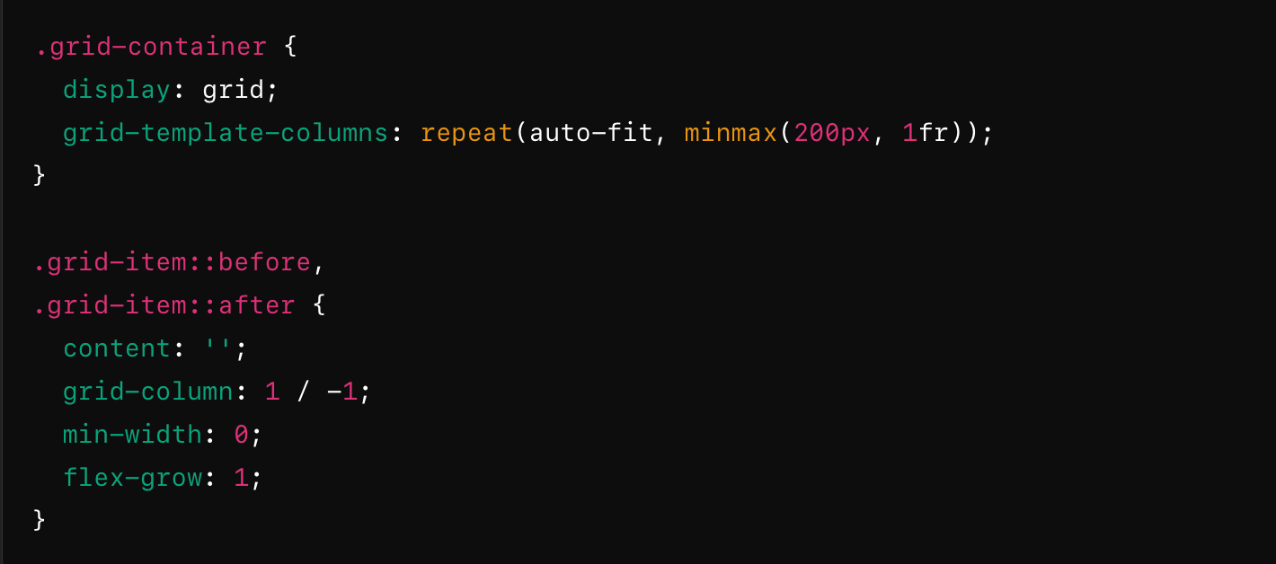
- Using Pseudo-Elements: Add
::beforeand::afterpseudo-elements to grid elements to create flexible spaces. - Apply
grid-column: Give pseudo-elements agrid-columnproperty covering the first and last columns. - Define
content: Assign an empty value to thecontentproperty of pseudo-elements so that they display no visible content. - Adjust width: Use properties such as
min-widthandflex-growto make the pseudo-elements occupy the remaining space, centring the real elements in the last row.
This technique centres the elements on the last line without affecting the overall structure of the grid.
Code example
Here is an example illustrating this method:
This configuration ensures that the elements in the last row are centred, even if they do not fill the entire width of the grid.
Conclusion
By combining grid-auto-fit with pseudo-elements and appropriate CSS properties, it is possible to elegantly centre the elements in the last line in a grid. This technique improves the aesthetics of responsive layouts and provides a more harmonious user experience.
For a visual demonstration and detailed explanations, watch the video below:
Comments ()